

In this project we had to create a new sub brand for an existing brand. It could be anything we wanted. I floated around the idea of sub brands for Converse, Red bull, and Monster because these are all brands that I use often, if not daily. After talking to my teacher about the ideas, I came to the conclusion that Red Bull would be the best fit. I loved how Red Bull has so many different flavors to choose from, but they were missing something, an alcoholic version. With Mountain Dew Hard and now Monster having an alcoholic drink, I thought that this would be perfect. I wanted to create something that I would use, and that my friends could also use.
The first thing I had to do was create a new logo for the brand. I did not want to completely stray away from the brand identity, so I made sure that it was in there somewhere. I wanted to incorporate the bull in some way because I thought that the bull would be a good staple to the "hard" aspect.


We had to create 15 different logos, 3 type, 3 pictorial, 3 abstract, 3 initial, and then 3 of everything combined. After sketching out all the logos I took them to illustrator and drew them up in there.
After I created the initial 15 logos, I did not like how any of them looked. So I went back to the drawing board and created 15 more.

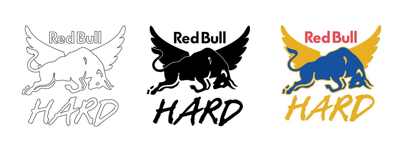
I was able to narrow the designs down to only three different designs but now I had to add a color pallet and make sure the logo would look good in all white and all black. Creating the color pallet was difficult because I wanted to stick with the red, blue, and yellow like Red Bull, but I didnt want to copy the original design. I ended up going with the same red and blue, but I made the yellow a bit darker. Then I added the colors to the logo designs in different ways.


After getting opinions from family and friends I finally landed on this design below. I really liked how it turned out and feel like its similar the original logo while also bringing out something new.

Since I finally got the logo done, I had to move on to the deliverables where the logo would be incorporated. We needed 4 different designs. The first thing I thought of was a new can design. I didn't have many sketches because I knew the idea that I wanted to go with.

I took the design to Illustrator and mocked it up to how I liked. Then took the design over to Photoshop and created a more realistic mockup.


For my next deliverable, I thought it would be really cool to make a neon sign for either a bar or a gas station. This part was a whole new technique that I had to teach myself and I think it had a great outcome.


Patches have really started to become popular among teens and young adults and I thought it would be really cool to design some patches for the new sub brand, so that's what I did for my third deliverable.


Lastly, I knew that Red Bull was involved in a lot of racing as they have their own "Red Bull Racing" line. What better way to advertise a new product than a new shirt? I took some of the can design and put it on the shirt.

Once I figured out my final design, I took it to photoshop and mocked it up.


